This summer, the madcap, genre-defying adventure Ladyhoppers by Sarah Thérèse Pelletier and Scott James Taylor will be hitting bookstore shelves near you. Artist Chris Yarbrough painted a gorgeous cover for the book that everyone on the team is super excited about! Chris took some time to write about his process on the piece, and how he brought Charlie and Vera to life.

Hi! I’m Chris Yarbrough, and I painted the cover for Ladyhoppers. This was actually a formative piece for me, coming directly after a time of technical soul-searching. I had been feeling a rut begin to form in my illustration, and this project gave me ample room to try to break my own brain open.
The prompt was incredibly ambitious, and left me scratching my head in places. (Some places of my head had never been scratched in this way!) I wrung my mind out trying to fit all the client had been hoping for, and I realized that nothing short of everything would do. I decided to set all the pieces in a diagonal that would funnel into our main character, Charlie. At the time, I didn’t realize Charlie was the lead, so I put her further in the background with the other two characters talking nonchalantly in the foreground. The client got a kick out of this. It added an accidental dose of context, with Charlie cleaning up the mess, while Vera (in the foreground) bragged to her colleague.
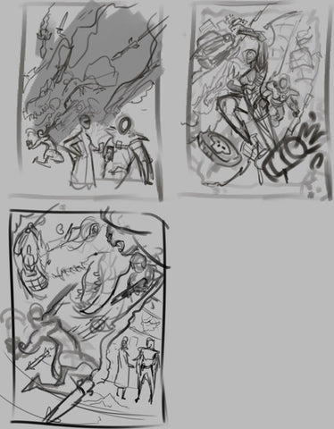
Rough drafts.
After deciding on a layout, I did a color test, to figure out in advance where I would be slamming hues and shredding values. From here, it was all about knocking characters onto the canvas. I used the flowy cloak of the phantom as the filler area for the title, and things kind of just came together.

Color comp.
Charlie herself went through a few redesigns, as I have a tendency to bulk out my characters with equipment, and greebles. The team wanted something sleek, but not 90s superhero sleek. (i.e. painted on). I think I landed at a happy place with her armor. I got to use the sheen of her suit as a kind of tribute to the deceptively simple use of limited values and shadow shapes of Frazetta (a poor tribute, but I’m no Fraz).

Charlie's suit design.
Vera was a different story entirely. I was able to run with the details and hangy-offy bits. More importantly, I got to test out a kind of new technique I had been working on. Instead of painstakingly drawing everything out, I would do the base shape and get everything to perspective. At this point I would put lines down as needed, but erase out areas, as well. Examples of this erasing out can be seen with the mechanical brace on her right arm, her segmented body suit, and the armor plates themselves. Even the lit-up displays were done by erasing out shapes from a black square.

An example of the process I used for Vera. I loosely scribble out the suggestion of shapes, and then refine with linework, and pull details out by erasing. This allows me to focus on just drawing, and adjust for lighting and perspective on the fly.
This was a giant departure from my old way of painting, which was to painstakingly paint and render every single object in space. This technique allowed me to get more complex and dense than I ever could before, and at a fraction of the time. Vera clocked in at about two hours of painting, versus similar characters which had taken a dozen (or more) hours and had nowhere near the amount of detail. I was able to use tricks to deceive everyone into thinking I could paint, and I fooled you all!
[Editor's note: We aren't fooled, Chris. You CAN paint!]
The background was a late piece of the puzzle (another departure from my previous method). The client requested rifts to other universes, with a burning blimp as the big set piece. I had dreaded exactly how to fit this in. I gnashed my teeth and pulled my hair out. I would angrily stare at the wall before suddenly weeping. I was so nervous, I lost control of my bowels! Then, I drew the damn blimp. It was delightful! The background images were all drawn in a light blue to both highlight the reds of our subjects, and to fall back along their limited value range. In a final move of what I can only assume was my limitless genius, I used an overlay layer with different shades of orange, to get that nice green. I have been studying the works of Noriyoshi Ohrai, and his jaw dropping compositions and color theory, and this piece is low-key a study of his body of work.

Base hue, Vera and Josephine.
I absolutely loved every second of this piece (even the bowels part!) and learned a lot about my technique, my inner child, and the value of friendship. Many thanks to the team working on this book and the Outland team. I felt a real sense of camaraderie and collaboration, that really made this just a joy to paint. I want to show this piece to strangers in rest stops. I want to read this book and cry. I want everyone involved to just have the best life ever.